
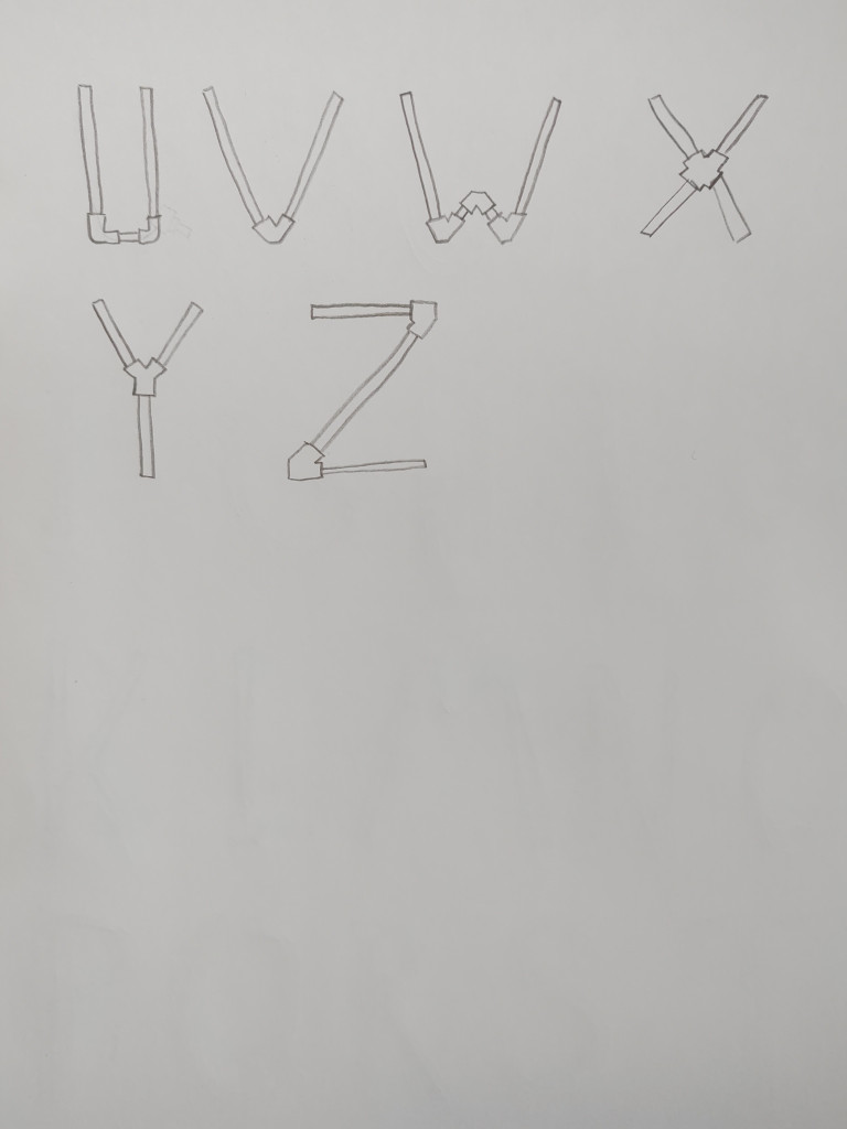
To create a steampunk feel, we gave a basic font some modifications. This first draft is hand drawn and we will expand on this basic design for consistency and detail. Inspiration was drawn from the themes found in typical steampunk settings such as pipes, grease, oil, wood, and nuts/bolts while leaving out typical themes found other in Victorian era inspired fonts.
We noticed that metal tubes and pipes are a significant theme in steampunk, so we primarily incorporated those elements into our design. The corners of each letter were made to look like pipe couplings and the remaining lines like threaded pipes. The pipes give us great versatility in designing the letters as there are many types of pipe couplings that help conjoin the straighter edges. For the future, we plan to add more detail and consistency within the draft along with minor modifications to the placement and scaling of some parts of the letters, as well as deciding on the appropriate amount of white space needed between the letters to capture the feeling we wish to give with the font.
