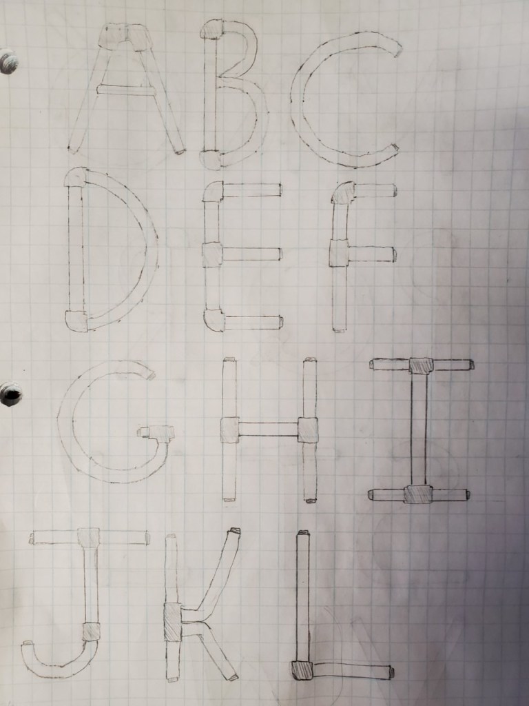


This is our second and most likely final draft. We included more detail within each individual letter such as some shading and small valves on the pipe connections. We believe that these small but significant details have created an appeal to our font that the demographic of Athena at Night will love.
Our goal in this draft was to create the perfect balance of complexity with readability. In an article by Derry Koralek and Ray Collins on the development of children’s reading, writing, and language skills, they claim that “Many play experiences support children’s emerging literacy skills.” This includes books like Athena at Night that stimulate a child’s learning experience with puzzles and other tasks requiring a higher level of thinking. This crucial time frame for children’s development pushes for a title that is easily understandable and recognizable by the readers as well as stimulates their brain and peaks their interest.
The choice to have the final draft being hand drawn was made for two main reasons. The first of which being that the price of most high end software such as Adobe Illustrator was simply not affordable, especially compared to how little we would use it in the future. The second being that we wanted to capture the creative and whimsical art style found within Athena at Night. We believed that small mistakes found within the font such as some pipes being slightly uneven or the edges having small pencil marks would create a feeling similar to the art style found within the book in addition to the steampunk theme.
All of these coming together, we still needed a name for out font. We decided that it would be something that tied the various themes found within the font:
